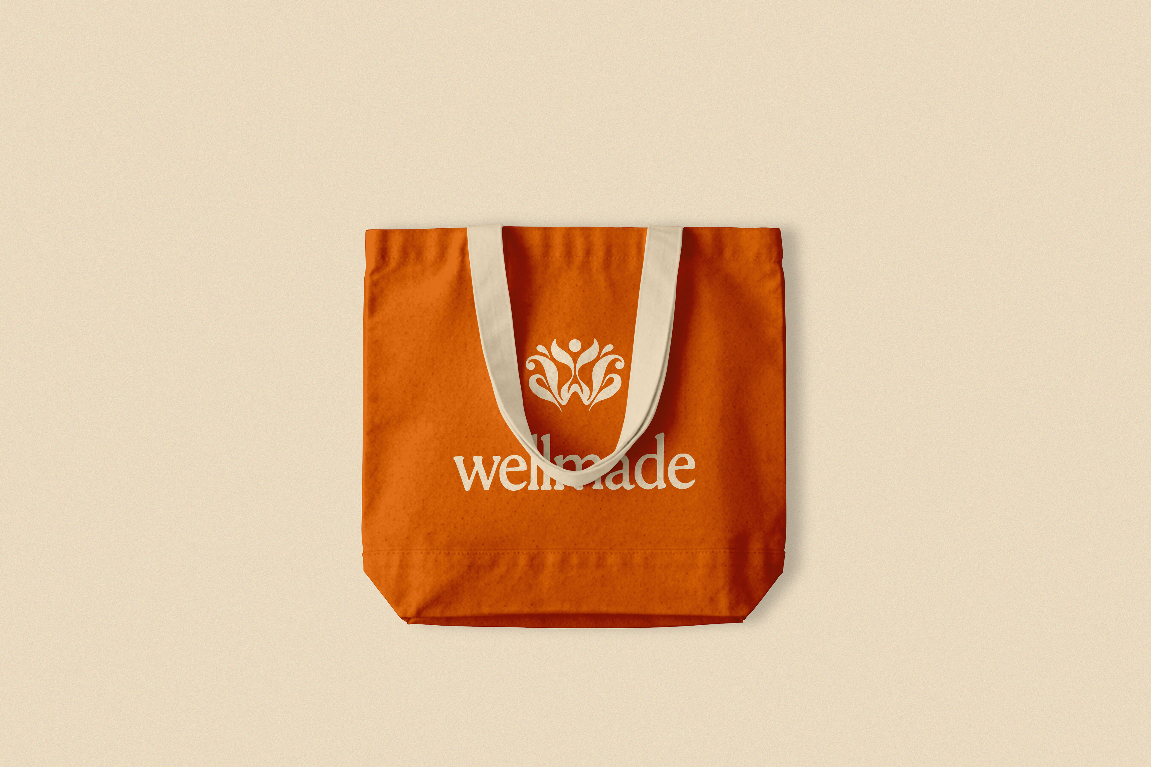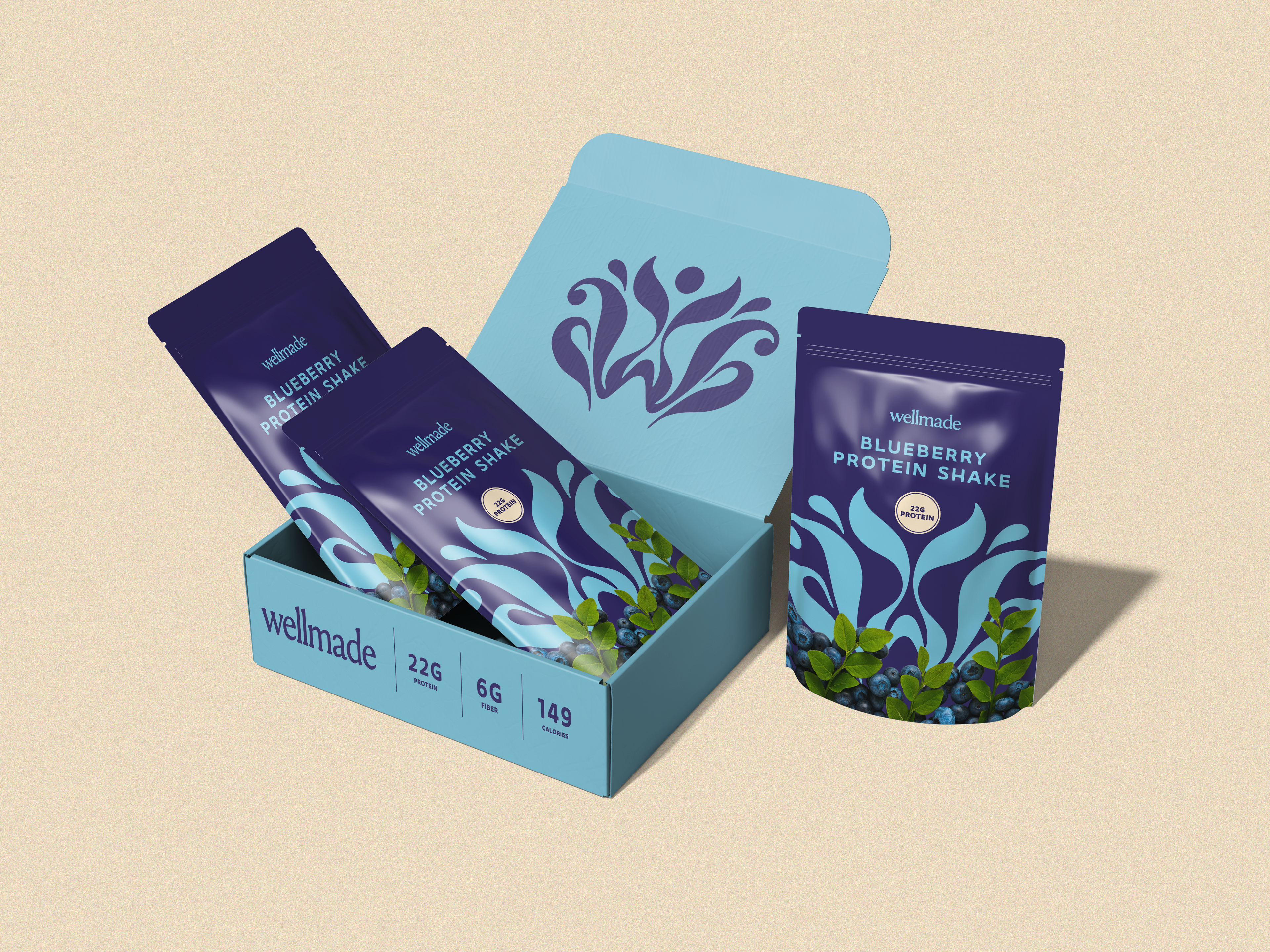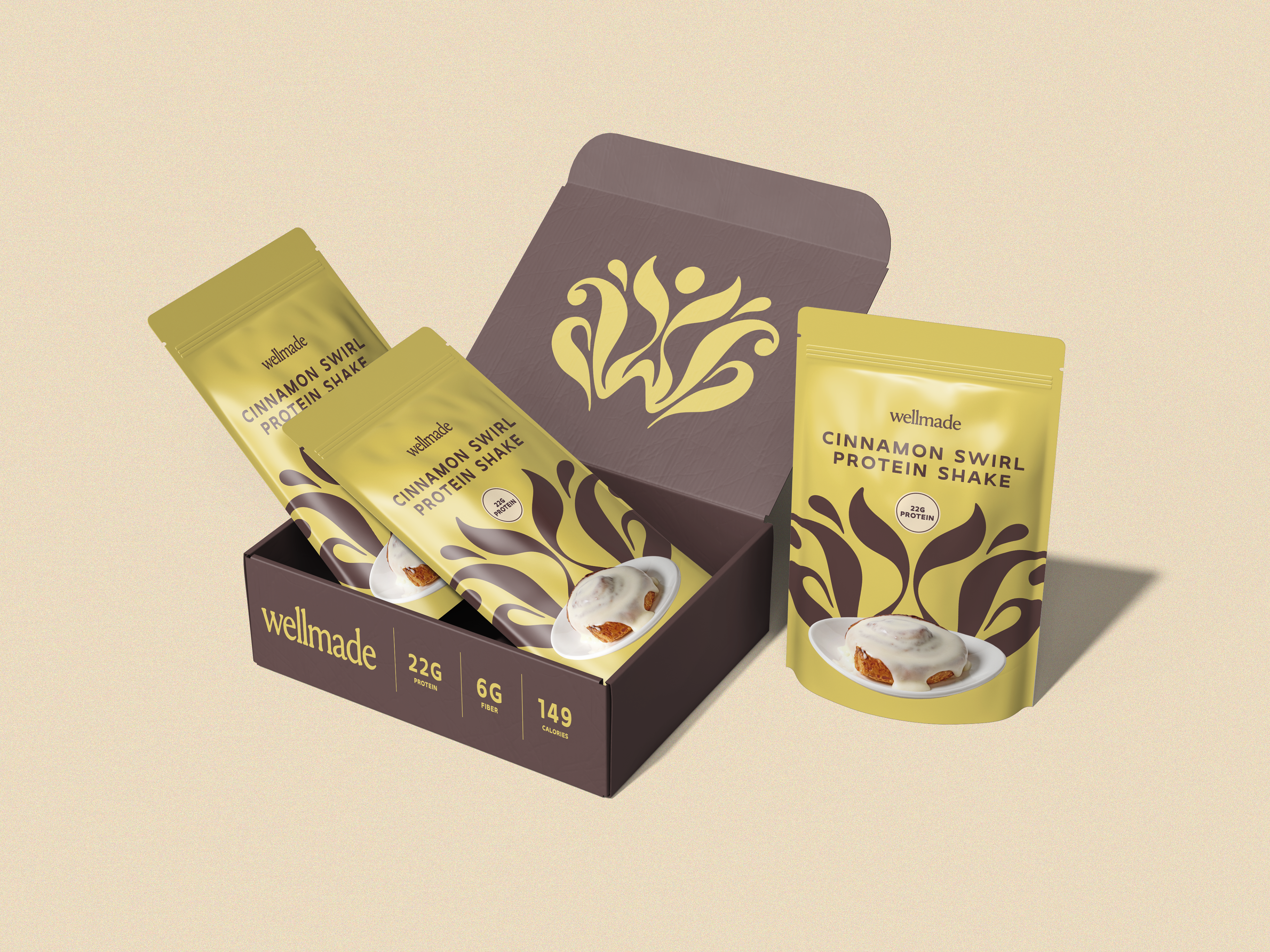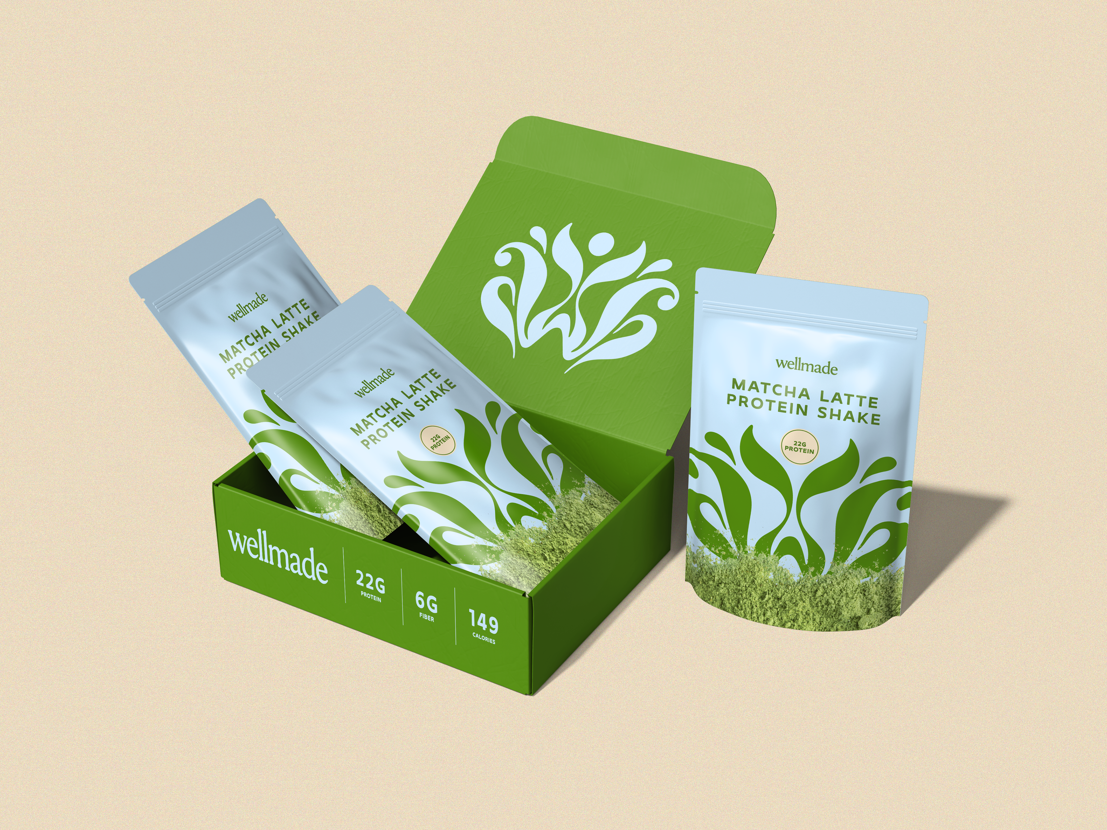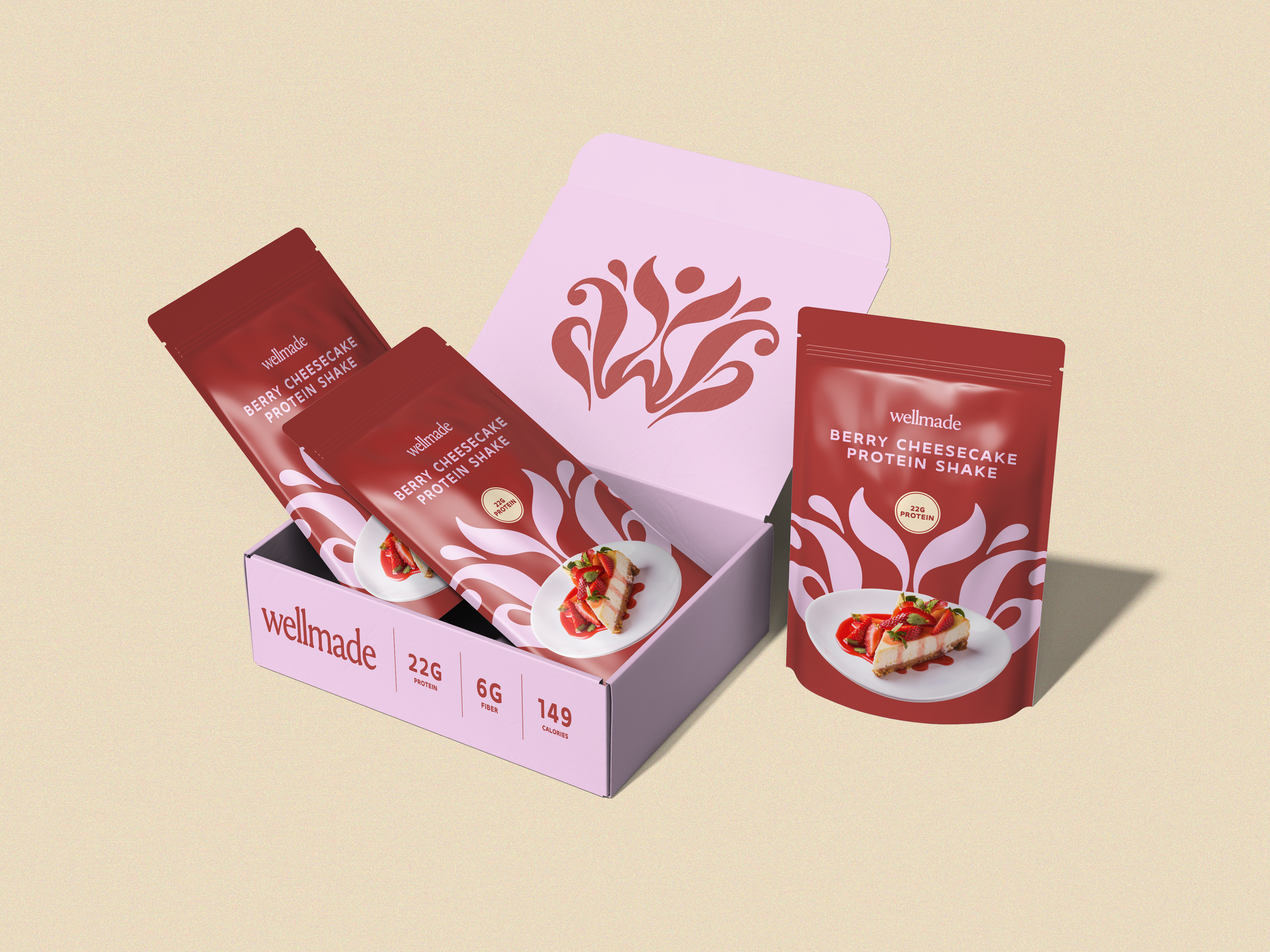

Wellmade is a protein shake brand with one bet: wellness doesn't have to look clinical to be taken seriously.
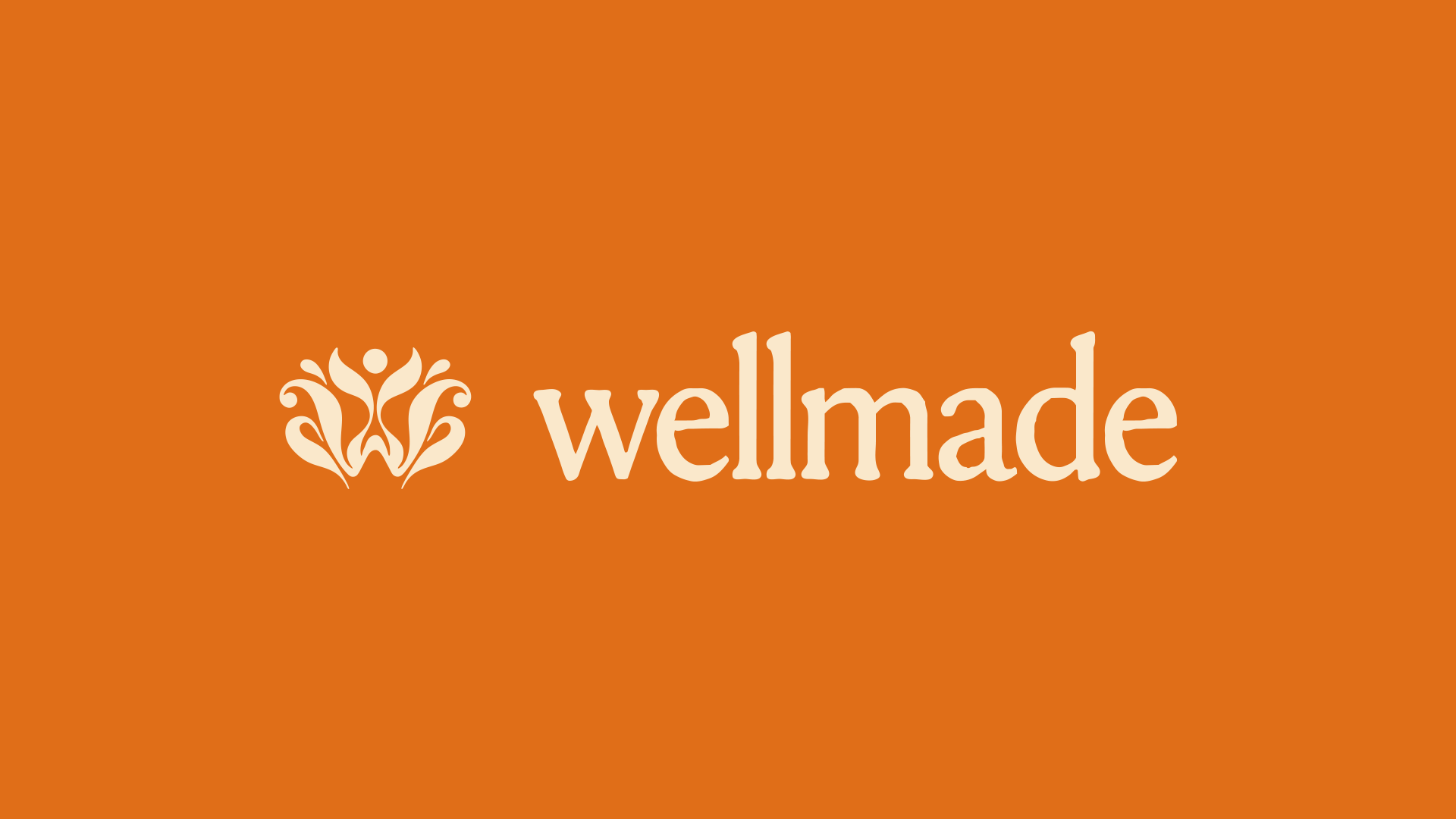
The mark does two things at once. Squint one way, it's a lotus opening. Squint the other, it's a person, arms up, mid-stretch. Wellness and the self, same shape.
First attempt was just a lotus. Pretty, forgettable. A flower on a box, not a brand. Then I tried the wordmark alone.
Clean, but it was missing something, some actual softness, some movement. The final mark is what happens when you stop trying to add femininity next to the logo and just build it into the linework itself.