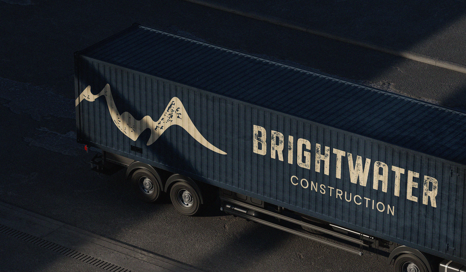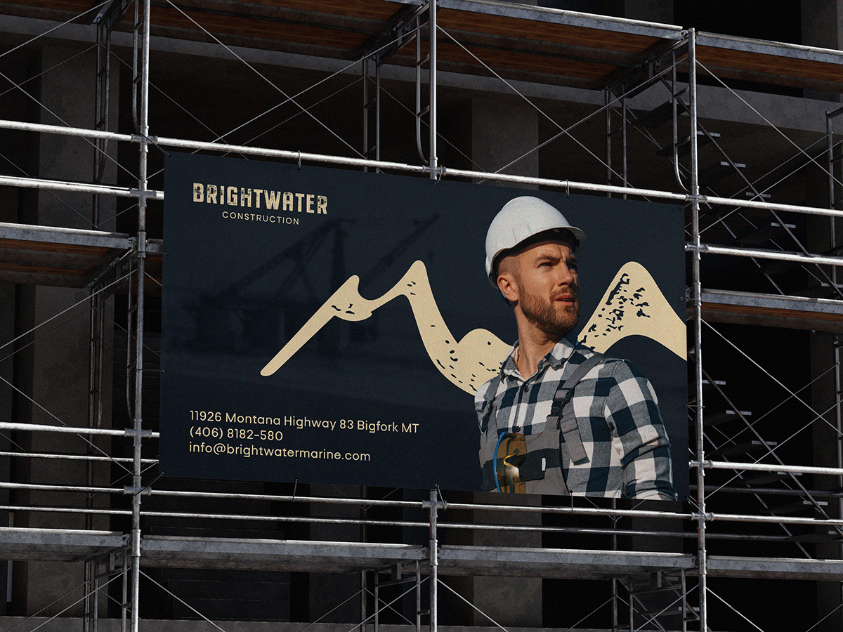
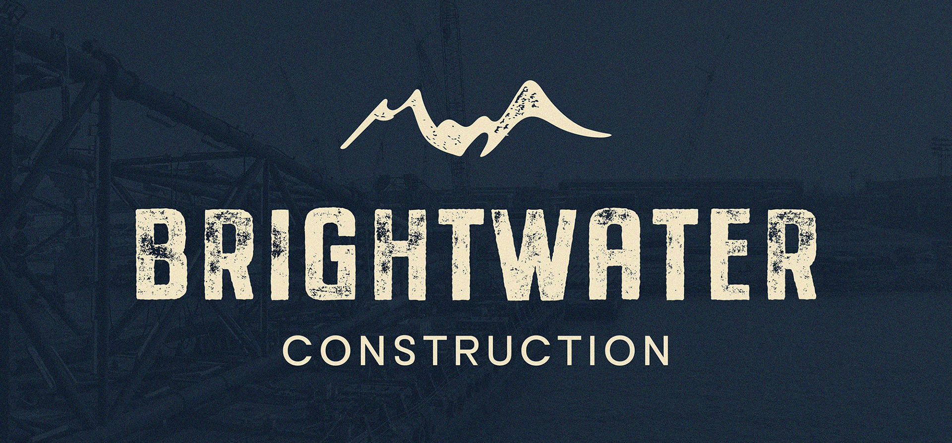
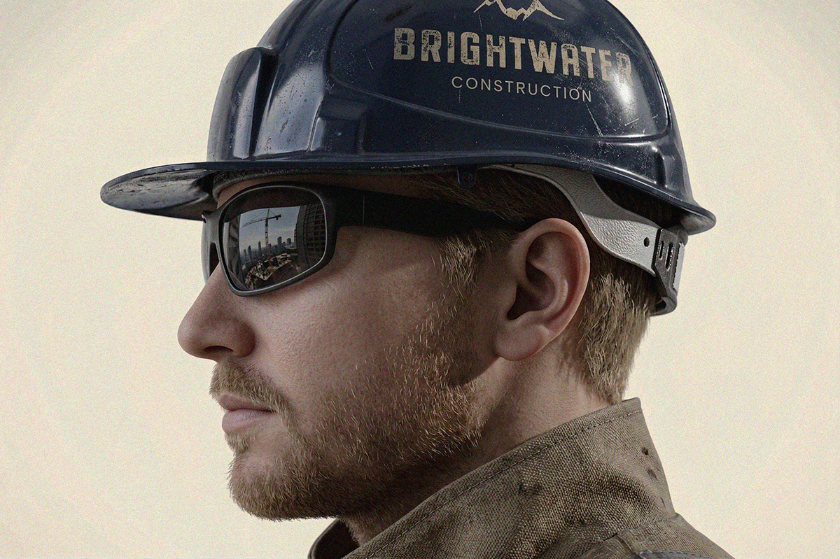
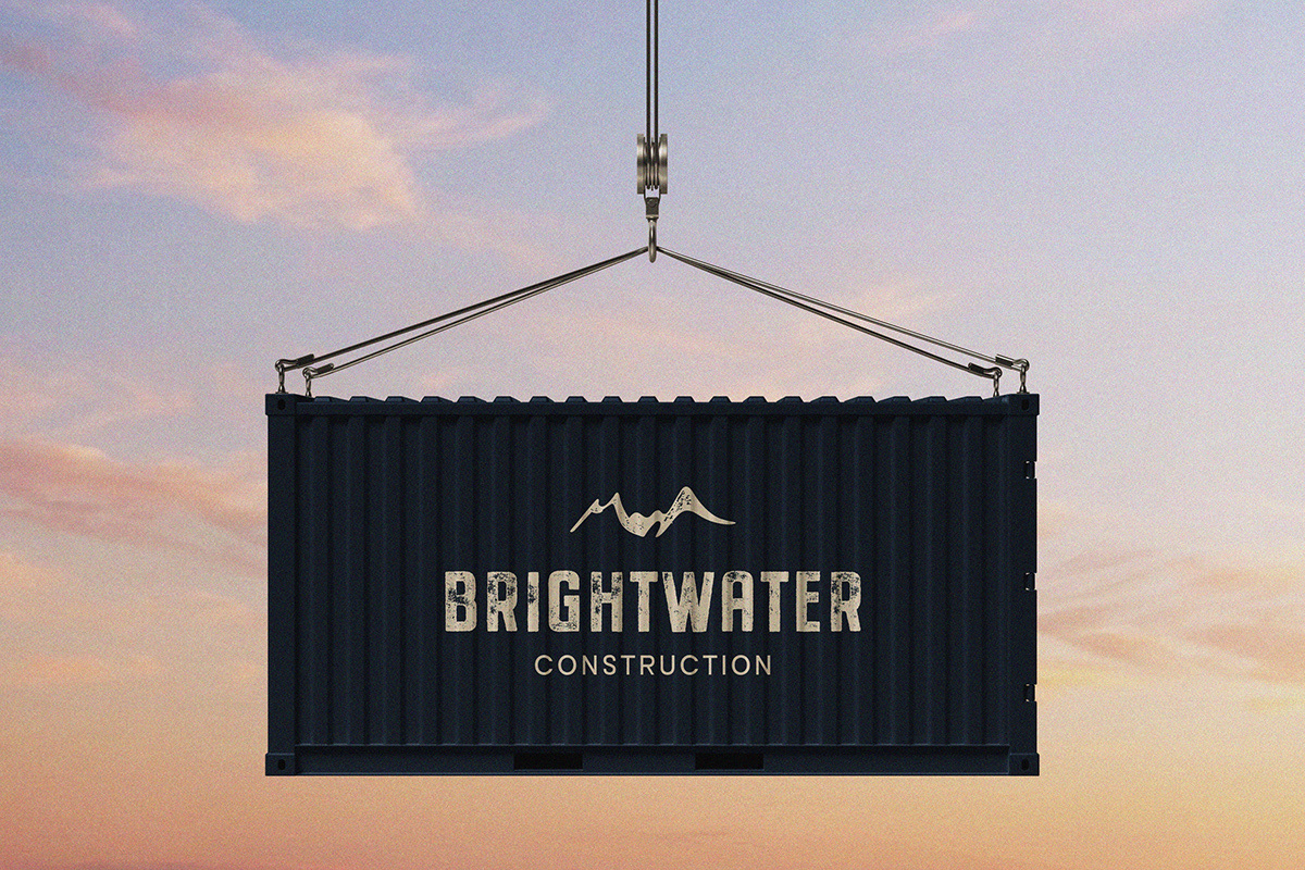
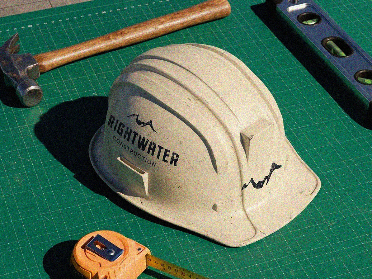
Brightwater Construction is based in Montana, so I wanted the identity to feel connected to the surrounding landscape without leaning on obvious or cliché visuals. The goal was to create something solid, simple, and practical.
A logo that would feel just as appropriate on a truck or uniform as it would online.
The symbol combines mountain shapes inspired by the Flathead Valley with a subtle ripple detail along the bottom to reflect the “water” in Brightwater.
The contrast between the structured peaks and the softer movement helps connect the company name to its environment in a way that still feels clean and usable.
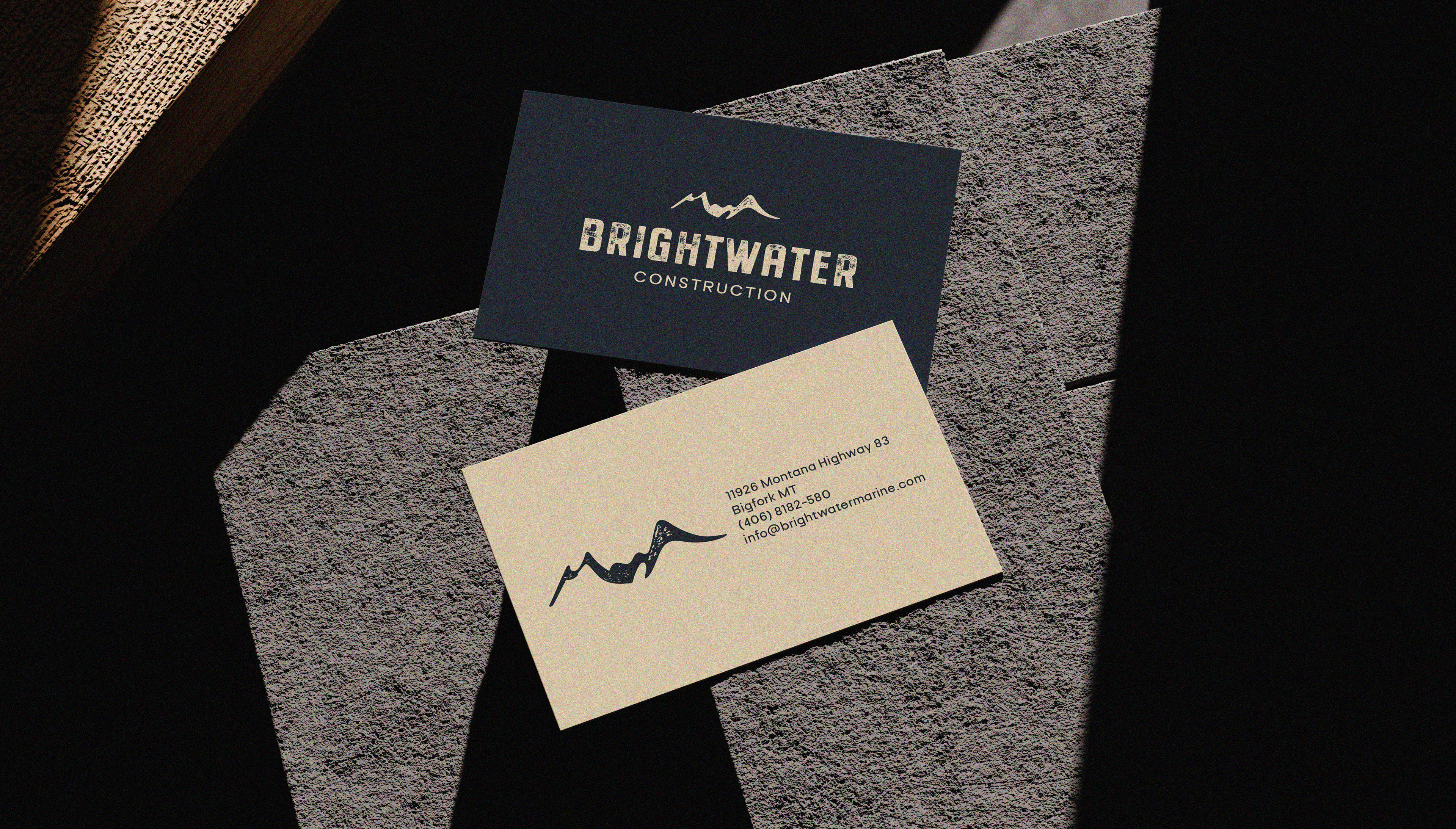
Although the final direction moved toward a different concept, this remained a personal favourite because of how clearly it ties the name to the landscape.