Paaru is a luxury jewelry house that specializes in pearls.
The name stems from the Japanese word パール, transliterated to PĀru and then simplified into Paaru.
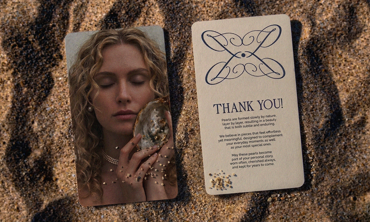
The primary logo is set in an elegant script typeface to express softness, femininity and timeless refinement.
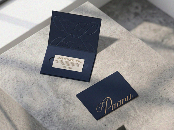
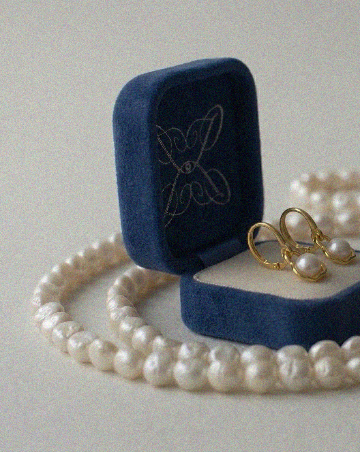
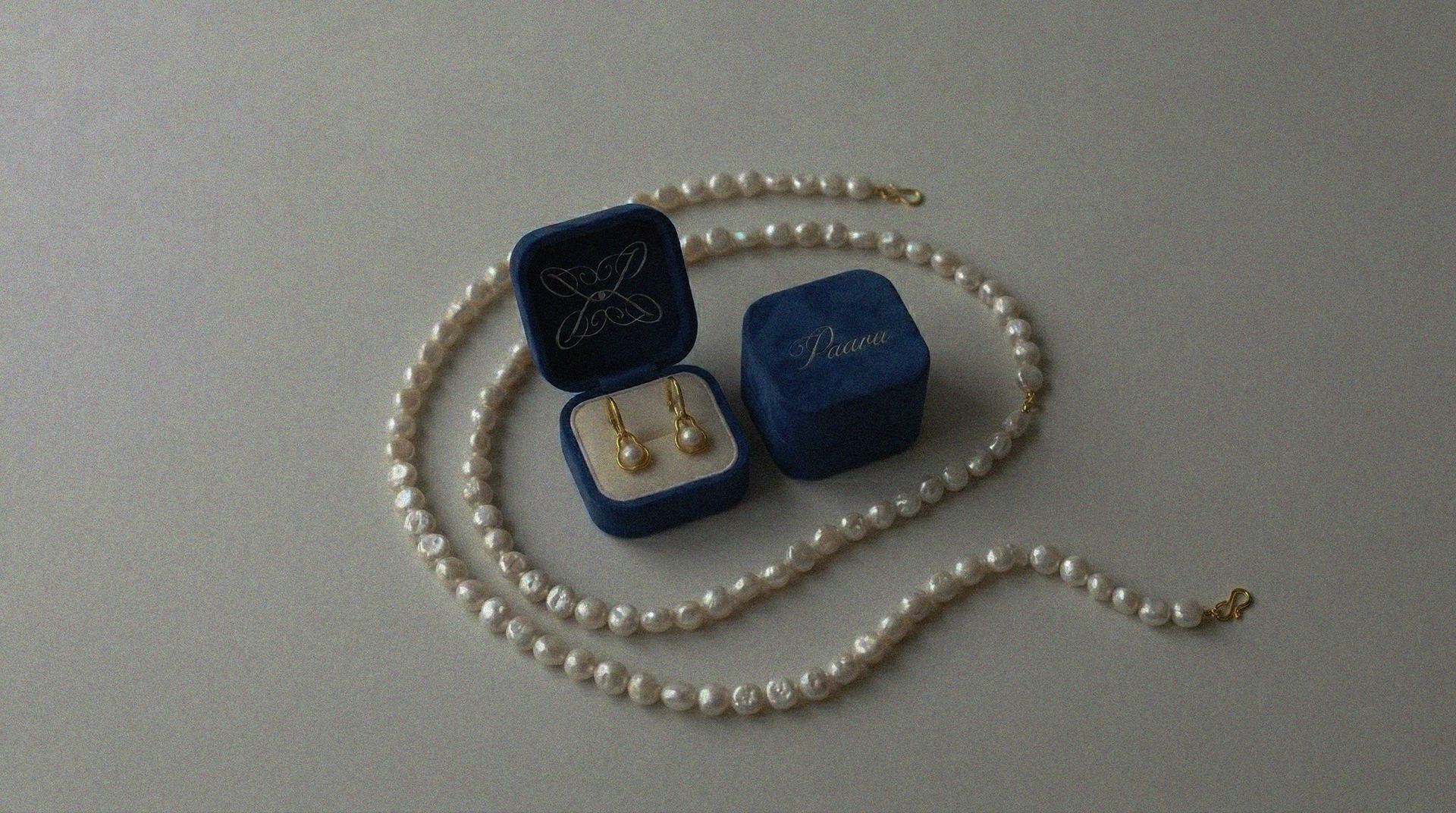
The mark is composed of four mirrored P letterforms, intersecting framing a central pearl.
The founder envisioned a brand identity that reflects luxury and simplicity.
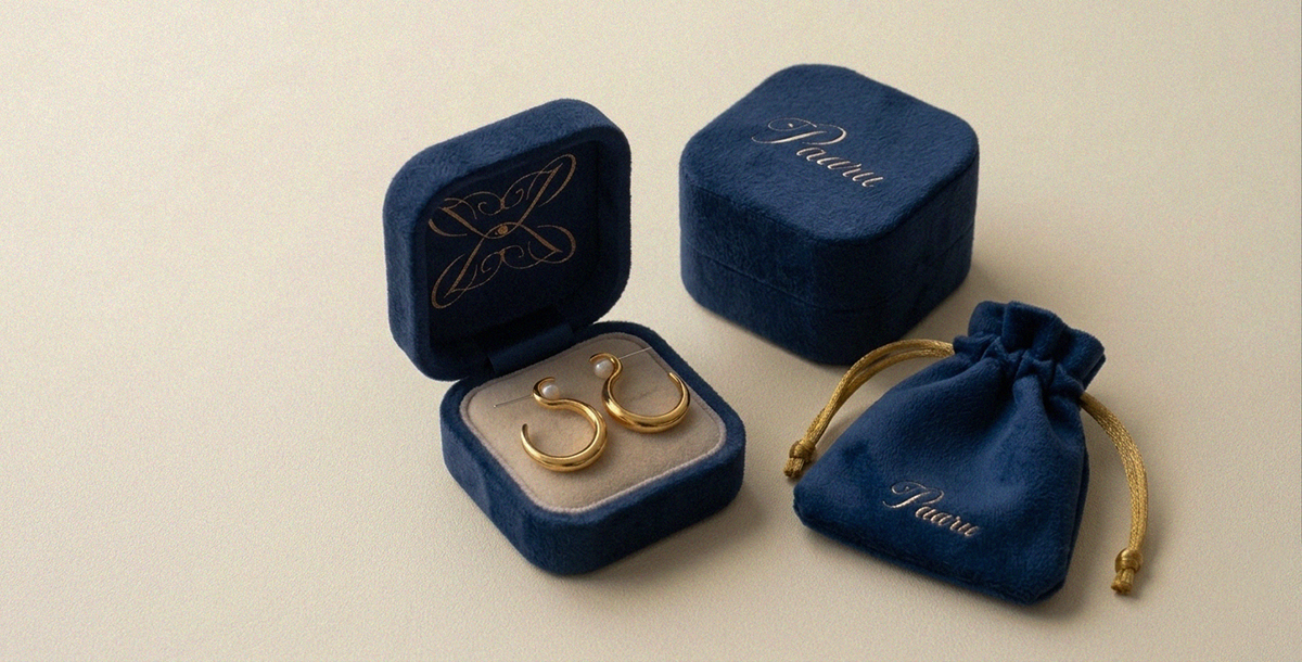
Japanese (Akoya) pearls rank a 2.5-4.5 on the Mohs scale, meaning they are relatively soft and scratch-prone when in contact with harsher surfaces.
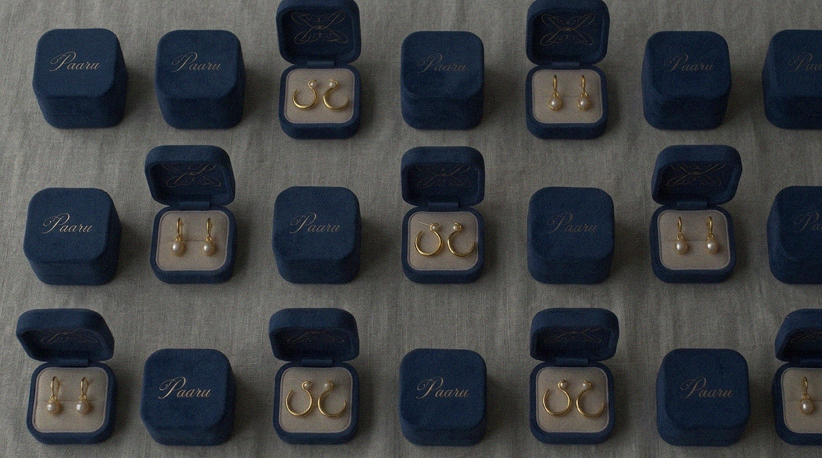
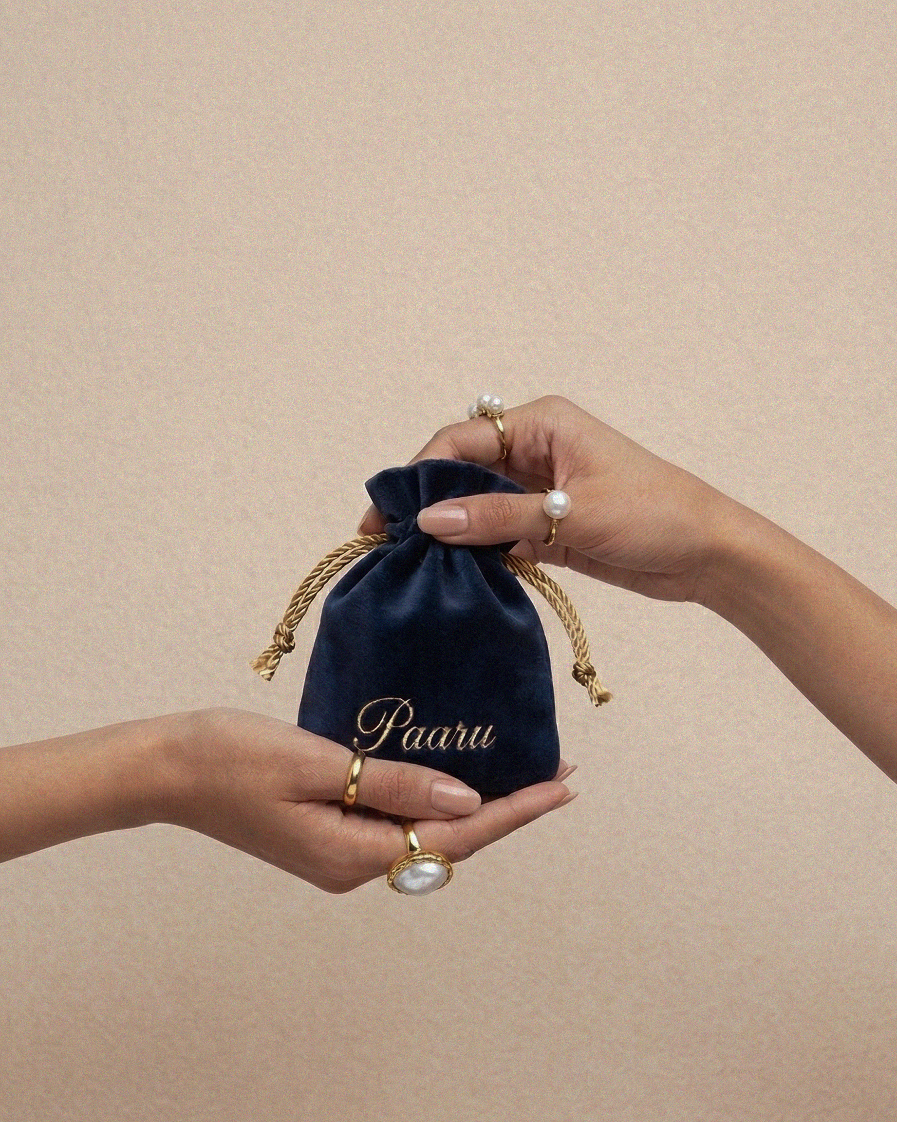
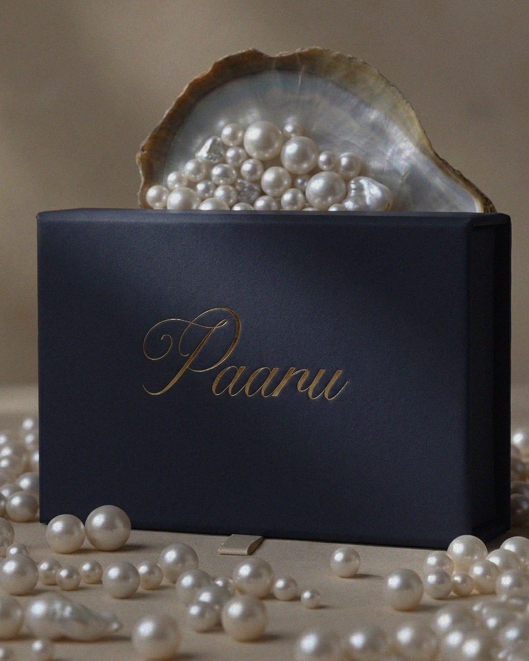
The packaging needed to preserve the pearl luster, so I incorporated a velvet pouch and structured box duo lined with velvet to protect and preserve the jewelry.